Design & Branding
How to Build a Strong Brand as a Streamer with Consistent Graphics
If your stream graphics feel disconnected, your brand probably does too.
A lot of streamers spend time improving their mic, camera, scenes, and content schedule, but their channel still does not feel memorable. Usually the problem is not effort. It is inconsistency. Their overlay looks one way, their alerts look another, their emotes follow a different style, and their badges feel like they came from a completely different brand.
That disconnect matters more than many creators realize.
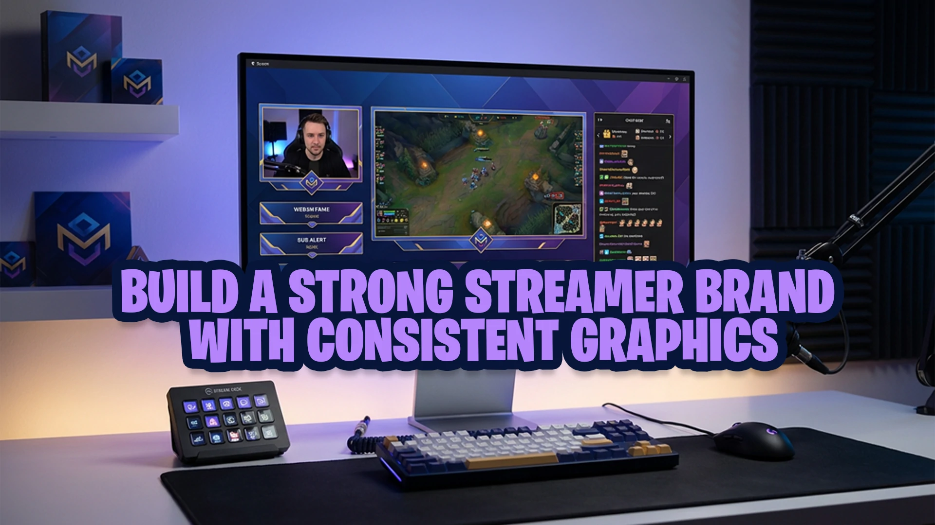
Strong streamer branding is not only about having a cool logo or a catchy username. It is about building a channel identity that viewers can recognize quickly and remember easily. One of the most practical ways to do that is by using consistent graphics across your overlays, alerts, emotes, subscriber badges, transitions, panels, and banners.
At Xpixel Studio, one pattern shows up often when looking at streamer channels: creators usually do not struggle because they lack personality. They struggle because their visuals do not communicate that personality clearly. When the graphics match the creator’s vibe, the entire channel feels more professional, more cohesive, and more worth following.
In this guide, you will learn how to build a strong brand as a streamer through consistent graphics, why visual identity matters, and how to make sure your assets actually work together instead of competing with each other.
What streamer branding actually means
Streamer branding is the overall identity your audience associates with your channel.
It includes your visual style, your tone, your energy, your content format, and the way your stream feels from the moment someone lands on your page. For streamers, branding is not abstract. It shows up everywhere:
- Stream overlays
- Alerts
- Stinger transitions
- Twitch panels
- Offline screens
- Channel banners
- Emotes
- Subscriber badges
- Thumbnails and social graphics
When those pieces feel connected, your channel looks intentional. When they do not, your stream can feel unfinished even if your content is good.
That is why visual identity for streamers is so important. Viewers make quick judgments. Before they understand your personality, they react to what they see. If your stream looks polished and cohesive, people are more likely to trust it, remember it, and take it seriously.
Why consistent graphics matter for streamers
Consistent graphics do three important jobs at once.
First, they improve recognition. If viewers keep seeing the same visual style across your overlays, alerts, badges, and social posts, they start associating that style with your channel.
Second, they improve professionalism. A stream that looks visually aligned usually feels more established, even if the creator is still growing.
Third, they strengthen community identity. Emotes, badges, overlays, and alerts are not just decoration. They help shape how your audience experiences your channel and how they participate in it.
This is especially important for creators who want to grow a serious brand rather than just “go live.” If you want your stream to feel memorable, your graphics need to look like they belong to the same world.
Personal brand for streamers starts with visual consistency
A lot of creators think personal branding means talking about mindset, values, or audience positioning. That is part of it, but for streamers, personal brand becomes visible through graphics.
Your visuals translate your identity into something viewers can instantly recognize.
For example:
- A cozy streamer may use soft colors, warm accents, rounded shapes, and relaxed motion.
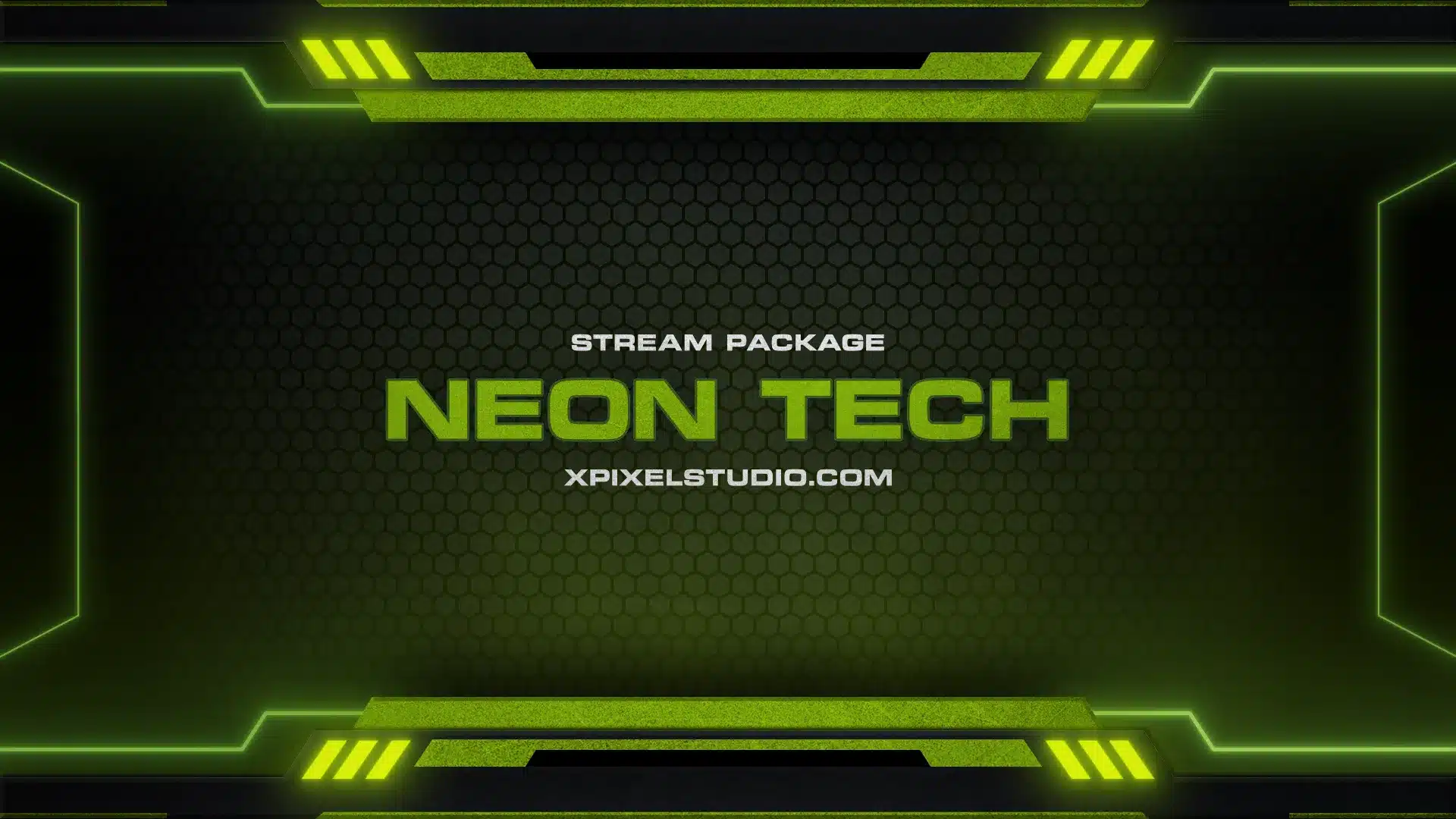
- A competitive FPS streamer may use sharper lines, higher contrast, stronger typography, and more aggressive alert animation.
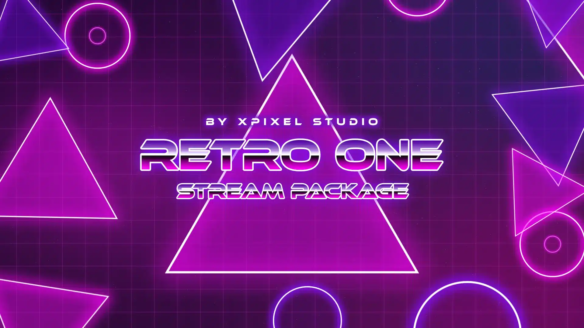
- A retro-themed creator may lean into pixel elements, synthwave colors, or nostalgic UI design.
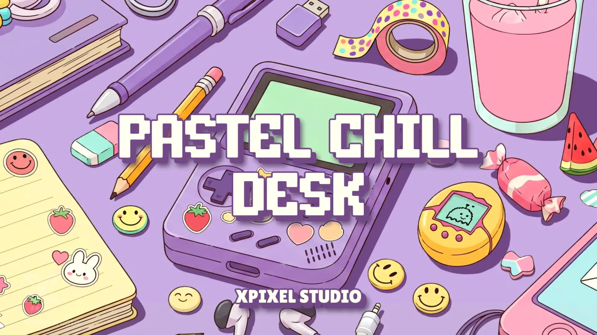
- A cute community-focused streamer may build branding around expressive emotes, pastel overlays, and playful badge progression.
None of those directions is automatically better than another. What matters is that the graphics fit the creator and stay consistent.
This is where many channels fall apart. The streamer has a clear vibe, but their assets do not reflect it consistently. Their personal brand might be chill and friendly, but their overlays look like esports templates. Or their stream package looks cyberpunk while their emotes are soft and cartoonish. Good assets used in the wrong combination still weaken branding.
Start with your brand identity before choosing graphics
Before you pick overlays, emotes, alerts, or badges, define the identity you want your channel to communicate.
Ask yourself:
- What type of experience do I want viewers to have on my stream?
- What three words should describe my channel?
- Is my content high-energy, cozy, competitive, funny, minimal, chaotic, or community-driven?
- What kind of viewers am I trying to attract?
- What visual style matches that audience and content type?
This step matters because graphics should support your content identity, not fight against it.
A common mistake is choosing assets only because they look impressive in isolation. A package can look beautiful on its own and still be the wrong fit for your channel. Good branding for streamers is not about chasing whatever design looks cool this month. It is about choosing a visual direction that reinforces who you are.
If you want more official Twitch guidance on improving your creator presence, Twitch also covers brand optimization inside Creator Camp.
Build a simple visual identity system
Once your channel identity feels clear, turn it into a repeatable visual system.
You do not need a giant brand document. You just need a few consistent rules that guide your graphics.
Choose a focused color palette
Most streamers do better with a small palette than a huge one. Usually one primary color, one supporting color, one neutral, and one accent is enough.
A tight color palette makes your channel easier to recognize and helps everything feel connected, from overlays to badges to social graphics.
Pick readable typography
Typography affects how your stream feels. It can make your brand feel modern, playful, edgy, premium, or casual. But readability comes first. Fonts that look dramatic in a design preview can become hard to read on mobile or during fast-moving stream moments.
Use a main font for headings and a clean support font for smaller information.
Define your shape language
Rounded elements, sharp corners, pixel boxes, neon frames, minimal bars, or illustrated panels all create different impressions. Try not to mix too many visual languages at once.
When your overlays, alerts, panels, and badges share a similar shape style, your branding feels stronger without needing extra complexity.
Keep motion style consistent
Animated alerts and stinger transitions should feel like part of the same visual world as your other assets. A smooth and cozy stream benefits from softer motion. A more intense gaming channel can support stronger movement and impact.
Motion consistency is underrated. Many streams feel disjointed because the static design says one thing and the animation says another.
Align illustration style across emotes and badges
If you sell or use animated emotes and subscriber badges, these should not feel separate from your stream identity. They are part of your branding system too.
This is one of the clearest signs of a polished channel: overlays, alerts, emotes, and badges all feel related, even when they serve different purposes.
If you want to improve your channel visuals step by step, you can also follow this stream design guide to understand simple design tricks that make your stream look cleaner, more consistent, and easier to recognize.
Which stream graphics should stay consistent?
If you want stronger stream branding, these are the assets that should work together visually:
- Overlays
- Alerts
- Stinger transitions
- Webcam frames
- Starting soon, BRB, and offline screens
- Twitch panels
- Profile banners
- Emotes
- Subscriber badges
- Social promo graphics or thumbnails
The goal is not to make every asset identical. The goal is to make them feel connected.
Your starting screen does not need to look exactly like your badges. Your emotes do not need to copy your overlay layout. But your audience should still feel they belong to the same channel.
Overlays are the foundation of stream branding
Your overlays are often the first major visual layer people notice during a live stream. They frame your content, affect readability, and create the strongest first impression.
Well-designed overlays should:
- Support the stream without blocking gameplay or camera space.
- Use colors and shapes that match the rest of your brand.
- Look clean across different scenes.
- Feel polished without becoming distracting.
If your overlay package looks great but everything around it feels mismatched, the branding impact gets diluted. That is why overlays should lead the system, not exist on their own.
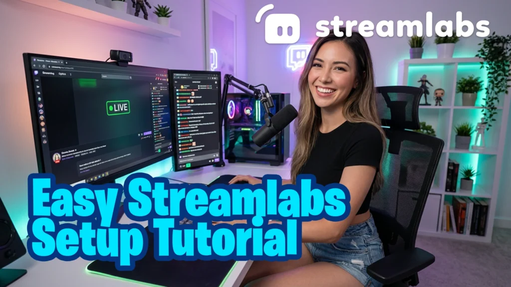
If you are still setting up your visuals, start with your overlay foundation first using this Streamlabs overlay setup guide.
Alerts are small moments that reinforce your brand
Alerts are easy to underestimate because they appear briefly. But they happen during high-attention moments. Follows, subs, raids, and donations are exactly the kinds of moments viewers notice.
If your alerts feel visually disconnected from the rest of your stream, they interrupt the experience. If they match your identity, they reinforce it.
Once your visual style is clear, make sure your notifications match it too by following this Streamlabs alerts setup guide.
The best alert design usually balances three things:
- Visibility
- Personality
- Consistency with your other graphics
This is especially useful for creators who want a stream that feels polished rather than patched together from unrelated assets.
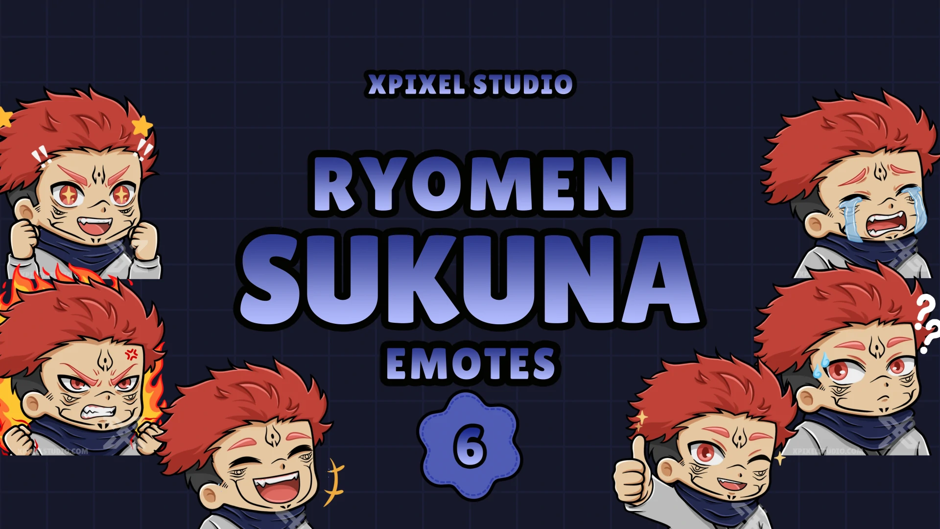
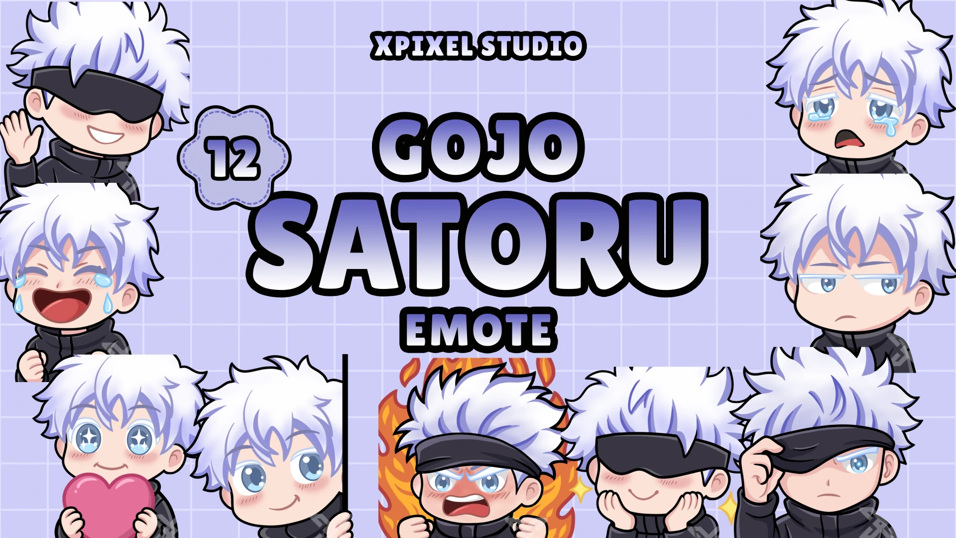
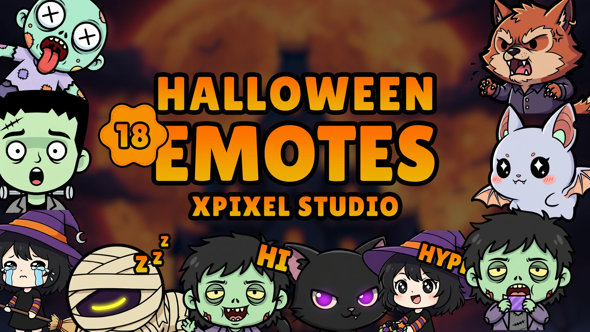
Emotes and subscriber badges are part of your visual identity
For many streamers, emotes and badges become some of the most recognizable parts of the channel.
They show up in chat, subscriptions, loyalty progression, and community interactions. That means they do more than decorate. They help shape how your viewers emotionally connect with the brand.
If your overlays feel sleek and modern but your emotes are random or off-style, your visual identity gets weaker. The same applies to subscriber badges. Badge progression should feel like part of the same brand system, not an afterthought.
This is one reason consistent streamer graphics matter so much. A channel becomes more memorable when the audience sees the same visual personality in the stream layout, in the chat experience, and in subscriber rewards.
If your channel uses custom emotes, this Twitch emotes setup guide will help you keep them aligned with your overall stream branding. Subscriber badges also reinforce loyalty and recognition, so you can pair them with your emotes by following this Twitch subscriber badges setup guide.
Panels, banners, and offline screens still matter
A channel does not stop branding when the stream is offline.
Panels, banners, and offline graphics affect how new visitors perceive your stream page. If those assets feel outdated, inconsistent, or generic, your channel can seem less established even if your live stream visuals are strong.
These elements are not the main attraction, but they help complete the brand experience.
Think of them as support assets that confirm the same message: this channel has a clear visual identity and knows what it is.
The most common stream branding mistakes
Some branding mistakes show up again and again across streamer channels.
Before fixing your full visual identity, it also helps to understand the most common graphics mistakes streamers should avoid, especially if your overlays, alerts, emotes, badges, and panels feel disconnected from each other.
Mixing too many visual styles
This is the biggest problem. One asset uses neon esports styling, another is soft pastel, another uses pixel art, and another is minimalist. Each element may look fine by itself, but together they reduce recognition.
Buying assets without a system
A lot of streamers collect graphics one piece at a time without checking whether they fit together. Over time, the brand becomes inconsistent even if each asset is individually decent.
Making graphics louder instead of clearer
Busy overlays, flashy alerts, and too many decorative effects do not automatically improve branding. Often they make the stream harder to follow.
Ignoring community-facing assets
Some creators invest in overlays but neglect emotes, badges, panels, or banners. That creates gaps in the brand experience.
Rebranding too often
Small refinements are healthy. Constantly changing your style is not. Viewers need repetition to remember a brand.
Premade vs custom graphics for branding
Both can work well.
A premade package is often a strong option if you want a clean, professional look quickly and need multiple assets that already match.
Custom graphics make more sense when your brand is already defined and you want assets built around your exact niche, content style, mascot, or personality.
The important question is not whether premade or custom is “better.” The real question is whether the graphics feel consistent across your channel.
A well-chosen premade package will usually outperform a random mix of custom-looking assets that do not belong together.
If you are unsure which style fits your content best, this guide on how to choose the perfect stream package can help you make a better decision.
How to audit your stream brand quickly
If you want to improve your channel branding this week, do this simple audit:
Open your channel page and look at your overlays, alerts, badges, emotes, panels, and banners together.
Then ask:
- Do these assets feel like one brand?
- Are the colors repeated consistently?
- Do the fonts and shapes look related?
- Do my emotes and badges match the stream style?
- Does the whole channel communicate the same vibe?
If the answer is no, you do not necessarily need to replace everything. Start with the most visible assets first:
- Overlays
- Alerts
- Emotes or badges
- Offline screen
- Panels and banners
That alone can make a big difference.
A strong streamer brand is built through repetition
Viewers rarely remember a channel because of one graphic. They remember it because the same visual identity keeps showing up again and again.
That repetition builds recognition. Recognition builds familiarity. Familiarity builds trust.
This is why consistent stream graphics matter so much. They help turn a channel from “just another stream” into something people can identify quickly.
When your overlays, alerts, transitions, emotes, and subscriber badges all support the same identity, your stream feels more complete. It feels like a brand, not just a broadcast.
Final thoughts
If you want to build a strong brand as a streamer, do not treat your graphics as separate decorations.
Treat them as one system.
Your overlays, alerts, emotes, subscriber badges, banners, and transitions should all support the same visual identity. That consistency makes your channel easier to recognize, more professional to look at, and more memorable to viewers.
You do not need the most complicated setup. You need a clear brand direction and graphics that reinforce it consistently.
That is what makes streamer branding work in practice.
FAQ
What is streamer branding?
Streamer branding is the overall identity of a streamer’s channel, including visual style, tone, content personality, and the graphics viewers associate with the creator.
Why are consistent graphics important for streamers?
Consistent graphics help viewers recognize your channel faster, improve professionalism, and create a stronger visual identity across overlays, alerts, emotes, badges, and banners.
What graphics should match on a stream?
Your overlays, alerts, transitions, emotes, subscriber badges, panels, banners, and offline screens should feel visually connected and follow the same overall style.
Can emotes and subscriber badges help with branding?
Yes. Emotes and subscriber badges are part of your community-facing identity. When they match your stream overlays and visual style, they strengthen brand recognition.
Should streamers use premade or custom graphics?
Both can work. Premade graphics are great for fast consistency, while custom graphics are better for creators who want a more unique and personalized brand identity.
Our Products